Publisher verification
Postman wanted to raise the quality of published APIs and set a clear standard. The team hoped that verification would improve content quality, increase engagement, and help the marketplace grow.
I led the design of a self-serve experience that guided publishers from discovery to application.
Time to completion: ~6 weeks (design + build in parallel)
Format: responsive web
My role: sole designer
Result: strong early adoption after launch, with self-verified publishers trending toward the 2025 target
Prototype: to play with a Figma make prototype of the proposal that started this project, click here

The Opportunity
Postman runs a marketplace where companies publish APIs for developers to discover and adopt.
However publishers didn’t share a clear sense of what “good” looked like. Some, like Meta (seen to the left), produced complete workspaces, while others published inconsistent or incomplete content. Developers couldn’t easily judge trustworthiness, and publishers didn’t know what Postman expected or rewarded.
To solve this, Postman introduced a self-serve verification program with clear standards and a badge. At the start of this work, fewer than 60 publishers had been manually verified. With self-serve in place, the goal was to reach ~10,000.
What verification does
Verification can be defined as a set of quality requirements for a platform. For Postman, it meant clear branding, accurate descriptions, getting-started guides, functional authorization, and content that reflected how the published API actually worked.
If verification can raise the quality level of published then it can drive a growth flywheel for the Public API Network:
Better content leads to better adoption.
Better adoption leads to more publishers wanting to meet the standard.
As more publishers invest in their content, the Postman marketplace becomes a more reliable and popular place for developers.
Publishers make better content, nudged by a verification to-do checklist
Consumers engage more with the trusted content
Postman gets higher volume of traffic and conversions
Research
Comparative research
Postman didn’t have a research team, and timelines were short. Verification, however, is a familiar pattern in many consumer products, so I began by gathering examples from Instagram, LinkedIn, and TikTok. Because publishers already carry these mental models from daily life, I leaned into the familiarity. It allowed us to move quickly without introducing unnecessary cognitive load.
The consumer platforms are mostly aligned in their verification criteria: authenticity, uniqueness, completeness, activity, and notability
Their verification flows also follow a similar rhythm: education → checklist → submission → review

User research
A customer education session run by our CX team gave me access to eight verified publishers from companies like Oracle, HubSpot, and Paylocity. I adapted my interview guide into a group workshop and included an early design exploration for them to react to. My PM joined to observe.
What we heard:
Verification already improved the quality of their collections. One team reported fewer API errors afterwards.
Publishers wanted clearer engagement metrics, we interpreted this as a call for more analytics in their dashboard.
The participants asked for a transparent, actionable checklist to understand their progress towards verification.
One comment captured the theme:
“I’d prefer an actionable checklist, or a way to see how far I am through the process.”
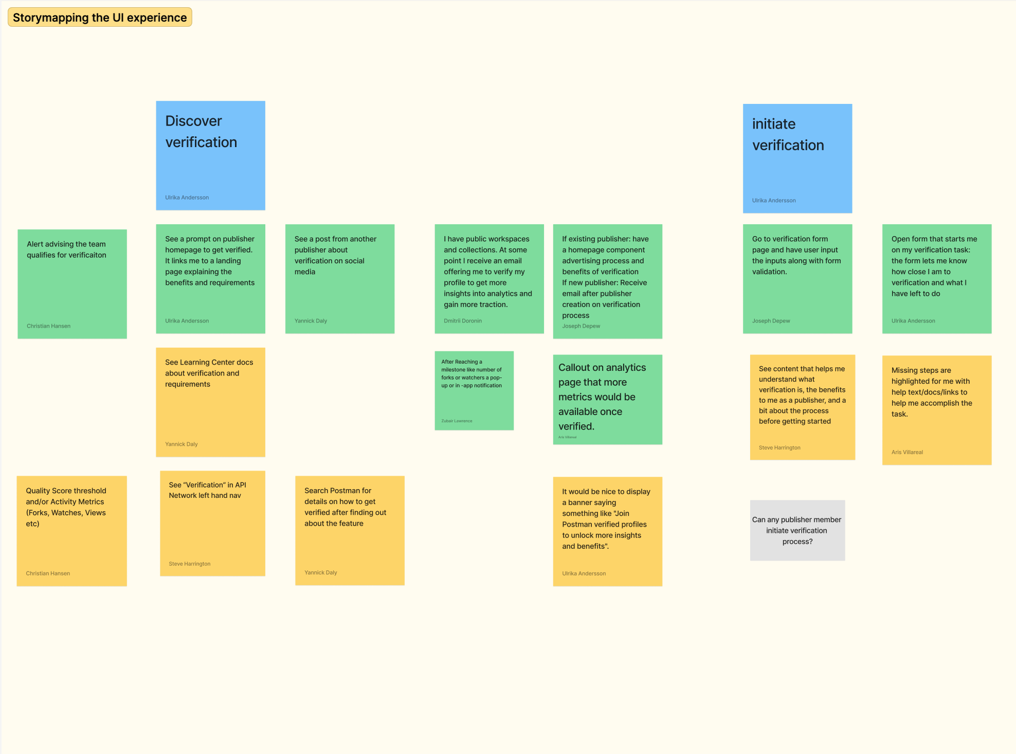
Co-creating requirements
I started the design phase with a short storymapping workshop. I use a format outlined by Anna kayley on the Nielsen Norman blog. It’s a tool I use often because it creates alignment quickly and brings PMs, engineers, and customer-facing teams into the work early.
Three key journeys emerged:
The user wants to understand what verification is and whether it’s worth pursuing
The user starts the process without confusion or delay
The user sees progress clearly and knows when they are ready to submit a request for verification

Sitemap
Most consumer products place verification in profile or account settings. This mapped cleanly to Postman’s publisher settings.
Because I had reorganized publisher navigation and simplified the publisher sitemap in an earlier project, we already had a clear, consistent place to add the feature.
User flows
Most consumer products place verification in profile or account settings. This mapped cleanly to Postman’s publisher settings.
Because I had reorganized publisher navigation and simplified the publisher sitemap in an earlier project, we already had a clear, consistent place to add the feature.
Flow diagrams and mini-wireframes came next. These aren’t glamorous, but they’re the tools that allow a team to work in parallel. The verification checklist sounded simple, but the underlying tasks touched many parts of the product. Mapping everything out meant engineering could start building while I refined the UI. The diagrams became our shared reference point and commitment throughout the project.
Interaction model
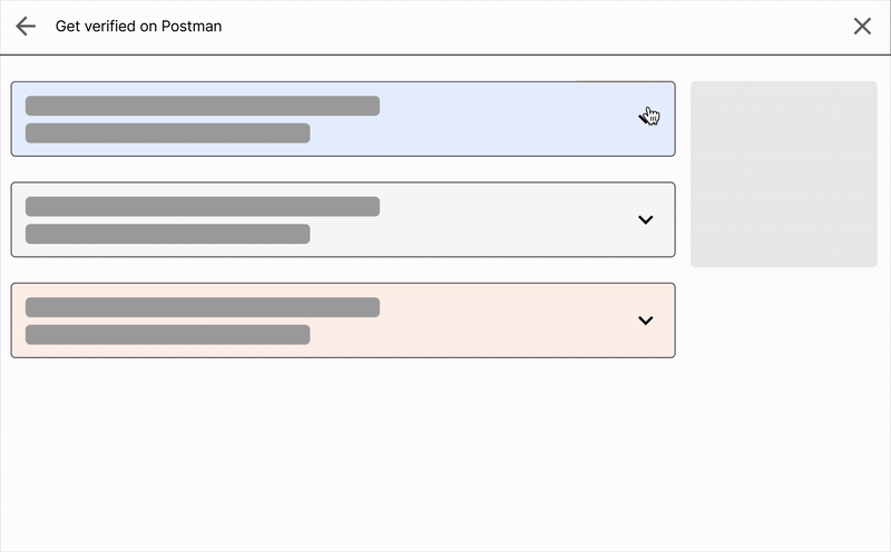
To get verified, publishers would need to complete a mix of tasks—some trivial, some quite involved. I created a low-fidelity prototype to test whether a single interaction model could support all of them, and scale without becoming confusing.
My team settled on a simple structure that could stretch its functionality, from basic confirmations to more complex reviews of lists of assets.
Once the team agreed on this model, we had a strong foundation for front-end design.

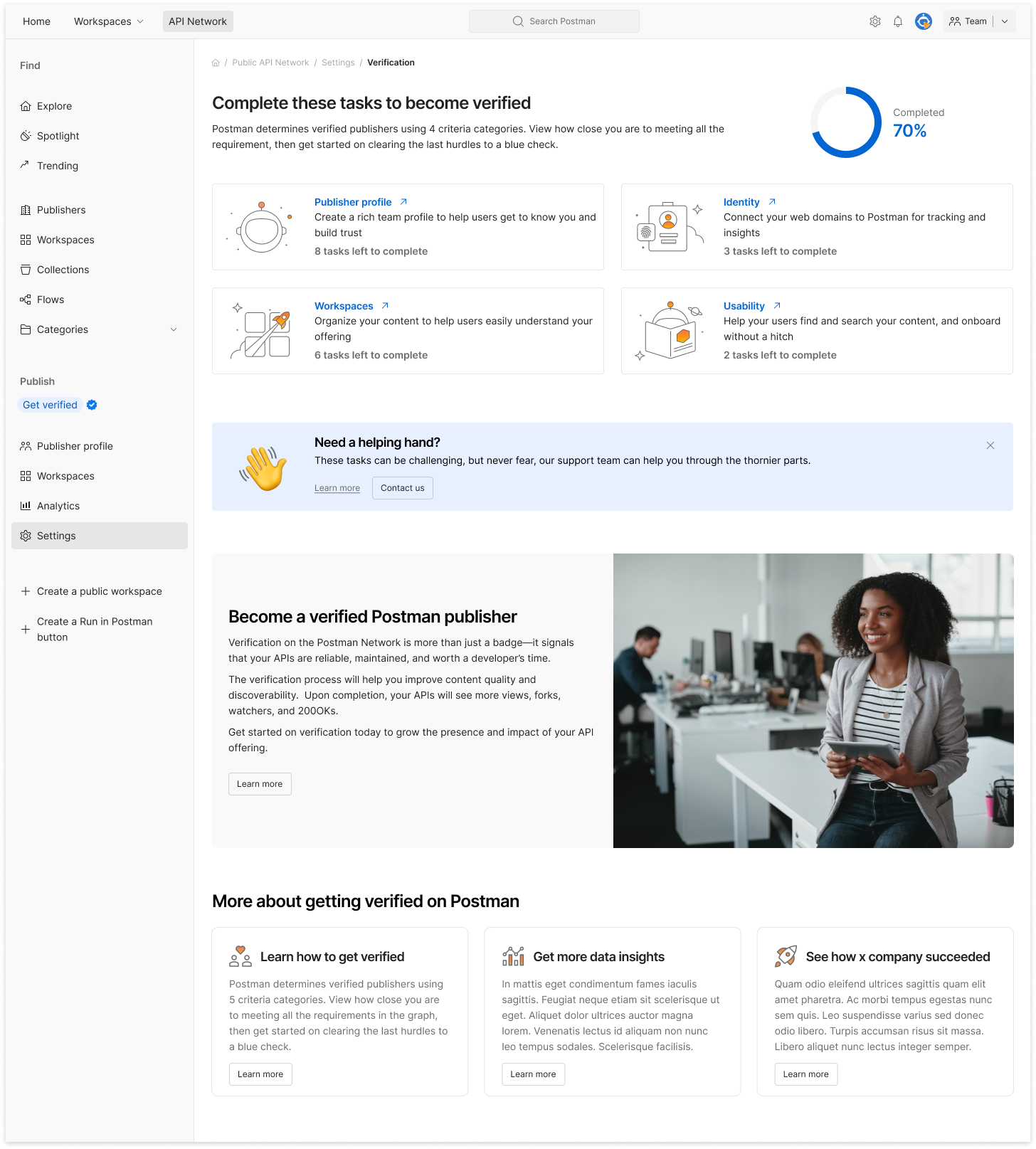
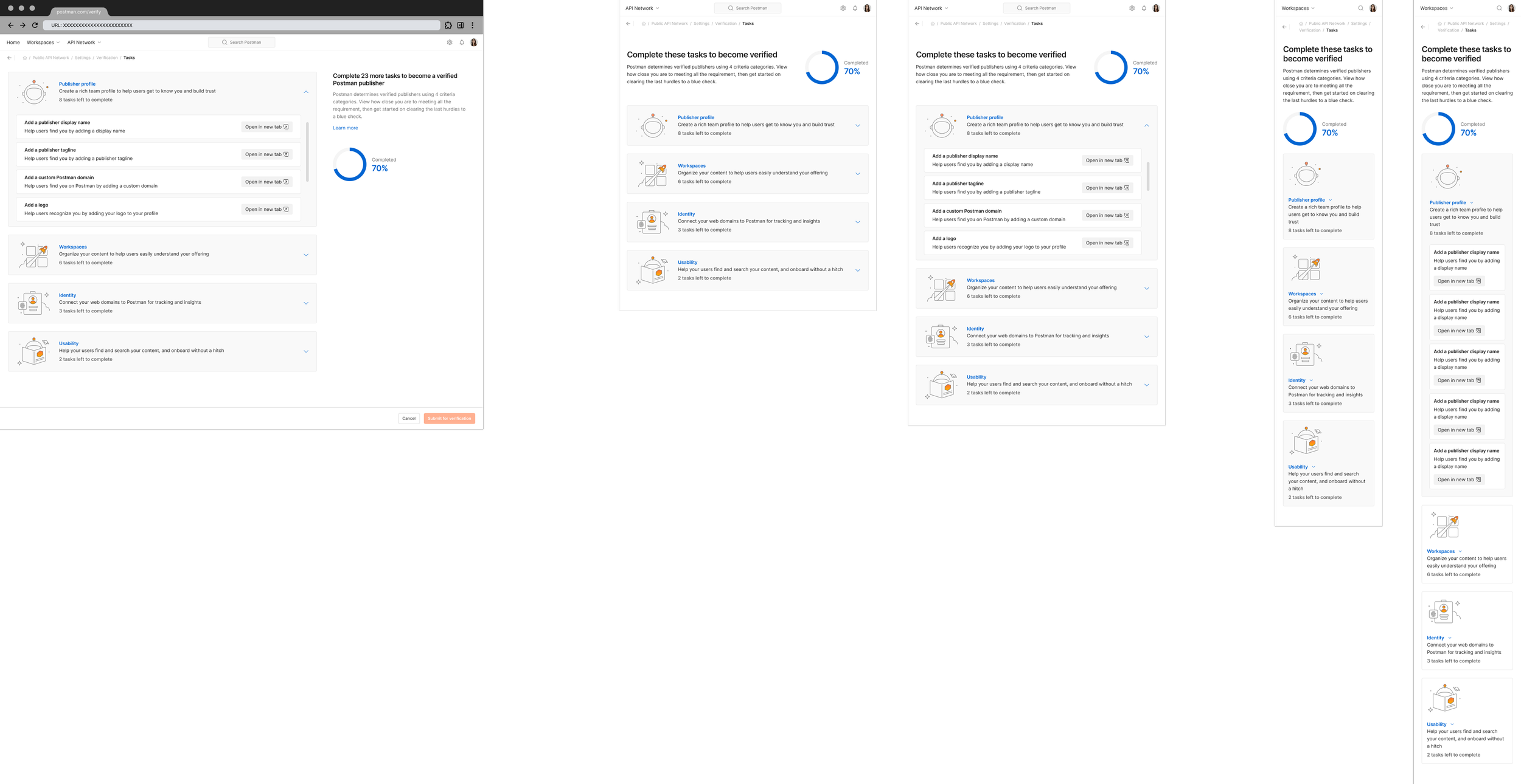
Screen design: landing page
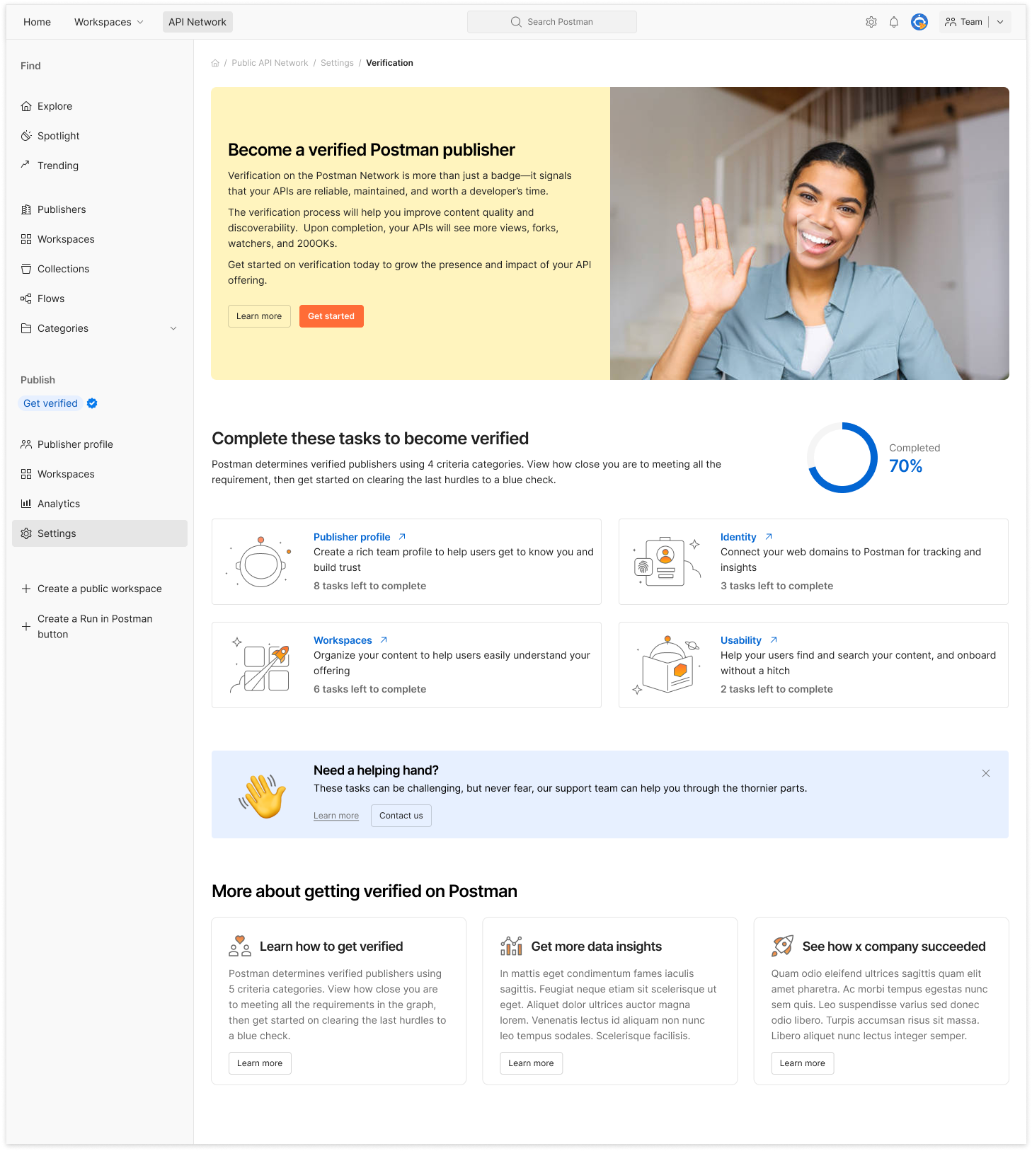
Feature homepage
Modules of relevance
Screen design began with the feature homepage. Users would arrive at the verification flow through a nudge (email, tooltip) or via Publisher Settings.
The main page followed a modular structure:
First came a short explanation of why verification matters. This took the form of an educational video recorded by our developer relations team.
The main progress bar and a personalized task list came next.
Below the main content came a secondary value pitch and links to documentation or support, in case a user had scrolled all the way to the bottom, but had not yet found value.
The page is a progress meter
The page was designed to adapt as users made progress:
Completed tasks disappeared as they were completed, making room for the next priority
The layout of the page modules shifted depending on the user’s progress, so that the most actionable module would always be found on the top.
The goal was to keep the experience focused and reduce noise.
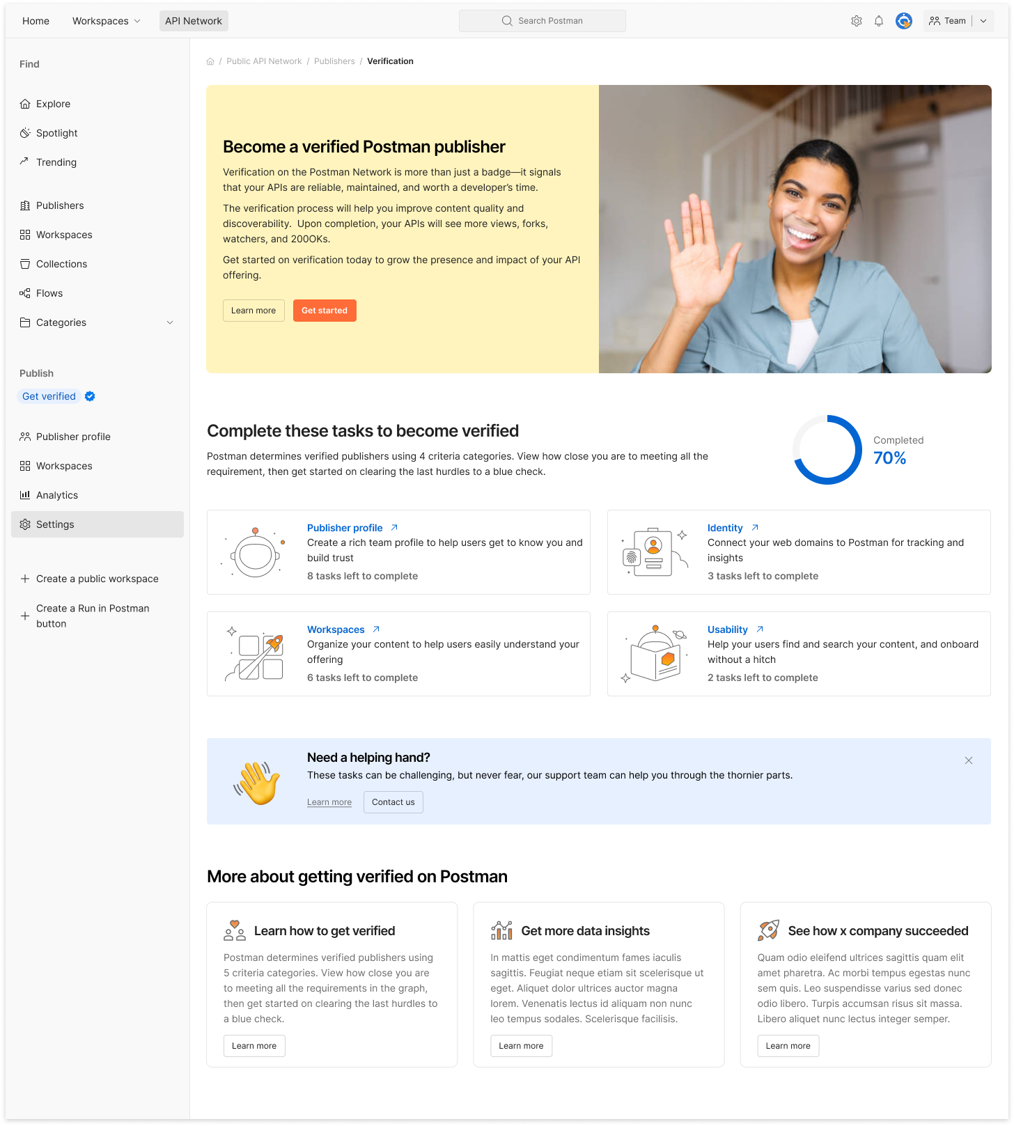
First-use page
Page with task progress
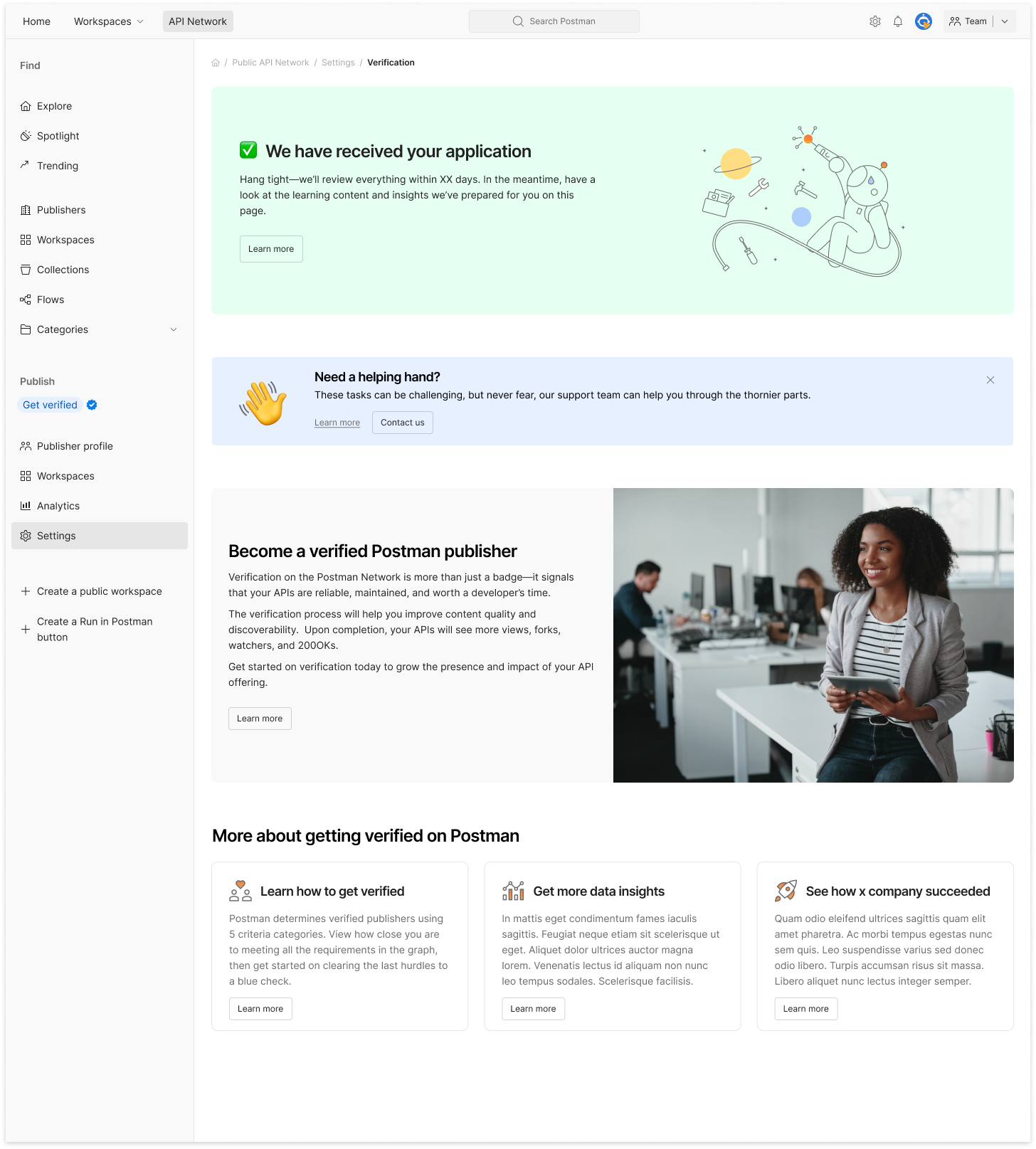
After user has submitted for verification

After user has been verified
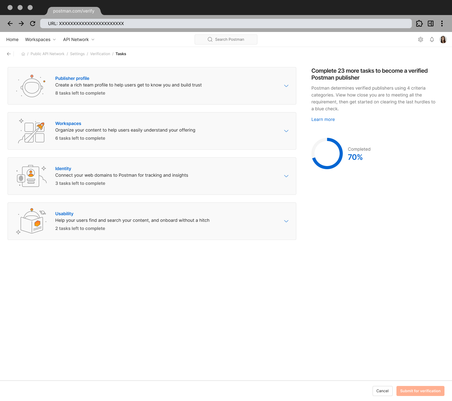
Screen design: submission form
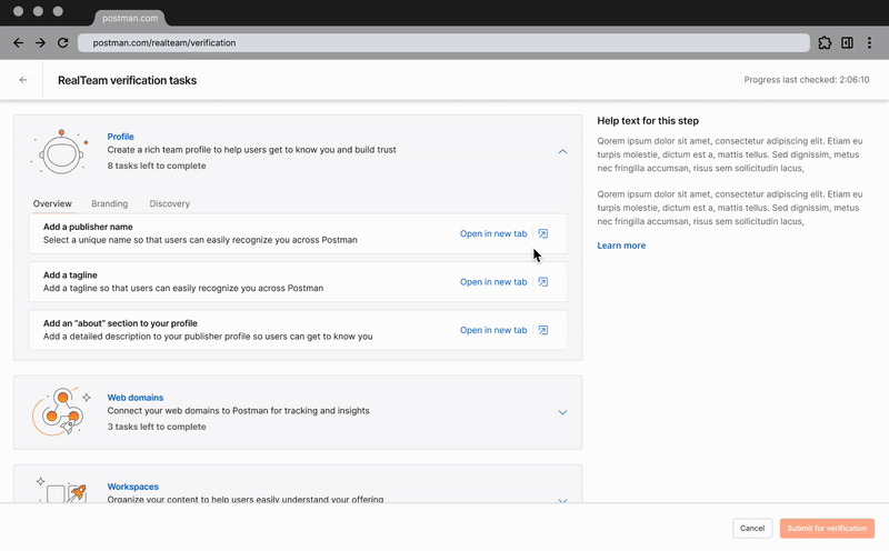
Once a user started verification, they entered a session page that took the shape of a submission form.
In the form, tasks were grouped to make a long list feel manageable, and the progress bar helped orient users throughout the process. Our earlier work on the interaction model made us sure thet this design would scale for complex cases.
When the last task was completed, the main page briefly shifted into a simple celebration state, then transformed into a general education page to help users get the most out of their publisher account.

Responsive design for accessibility and velocity
I typically design responsive versions of each screen to meet WCAG 1.4.10 Reflow, which requires content to adapt cleanly without forcing horizontal scrolling. Creating all breakpoints as I design each page gives engineering what they need to build responsively from the start, rather than treating accessibility as an afterthought.

Collaboration & communication
Throughout the project, I had to consider that engineering started building before I had started designs.
To make sure the pararlell workflow would work, I kept communication steady and artifacts clean (flows, storymaps, early prototypes). This minimized misunderstandings and closed feedback loops.
I shared updates 2–3 times a week, walked the team through decisions, and recorded Looms for colleagues in other time zones. Every prototype tied directly to a user story, which kept scope and priorities stable.
Our only real design disagreement was whether completed tasks in our form should collapse or stay visible. I preferred the shorter list; but engineering wanted everything visible for documentation and they had already built it that way. Both approaches were valid, and not worth escalating, so we went with the full list.
Reflections
By the time I handed off the last details, the full experience was already built across breakpoints. That speed came from early alignment, lean documentation, and steady communication.
I left Postman shortly after launch, but the PM later told me the feature saw strong adoption—and that the earlier navigation work had made this build far easier.
Before leaving, I also sketched an AI-assisted verification concept where Postman could pull proof directly from public sources. Even as a rough idea, it showed how much friction could be removed for publishers.