Publisher navigation
Postman had launched a marketplace for companies to publish their APIs. To support this, the team planned new features for publishing.
I led an effort to supply the marketplace with a new, navigation to support the planned features.
Time to completion: three months
Format: responsive web
My role: sole designer
Result: 71% increase in active publishers and 110% increase in new publishers in April 2025
Prototype: to play with a Figma make prototype of the proposal that started this project, click here
A video walkthrough of a prototype for the updated Postman marketplace navigation bar. The design brings together discovery features and tools for both API consumers and publishers, creating a single, streamlined entry point for all users.
Problem to solve
When I joined the team, I started by creating a sitemap. The map made it clear that the information architecture of the site didn’t support their multiple products, or their new features well.
The site didn’t clearly separate its four product lines. It still appeared as a single product with scattered navigation and poor discovery
Features like analytics were in mixed navigation bars, leaving users unsure if they were looking at numbers for private work or for publishing work.
The navigation component was inconsistent across the site, did not highlight selected items, or provide breadcrumbs.
In short, the site was leaving opportunities on the table. Users couldn’t form a clear mental model of Postman’s offerings, and publishers couldn’t find the features designed to help them. Using best practices from the field, I wanted to fix this.
Before: Marketplace features (seen here in red) were scattered across the site, with no clear hierarchy for consumers, and no unified view of tools for publishers. Analytics appeared in multiple navigation contexts, leaving it unclear whether the data reflected private work or published content.

Before: The marketplace home page focused almost solely on consumer discovery, offering little access to publisher tools. The top navigation gave no indication of where users were within the site, and the absence of breadcrumbs left them without orientation.

“Navigation should not only show where you can go but also where you are now.”
— Susan Farrell of Nielsen Norman group
The opportunity
I saw an opportunity to make the Postman marketplace more impactful by addressing navigation and information architecture. My pitch to the team went as follows:
Show the full offering. I built a proposed sitemap of Postman.com and proposed a new hierarchy where all publisher tools live under one branch.
Reveal hidden value. In the process, I uncovered powerful existing features, like a publisher directory, that were buried so deep they were invisible to users and hurting SEO.
Unlock the value of new features. Clear navigation ensures publishers actually see and adopt the new features that we plan to launch.
Redesigning the navigation could turn scattered features into a cohesive publishing experience, positioning the marketplace as a trusted home for both consumers and publishers.

Proposed: Group all marketplace features (seen here in red) under one branch of the site. This makes it easy for users to find every tool. It also improves SEO by giving search engines a clear path to crawl and index the full offering. The new branch provides a focused space to launch and test new features, arranged by user need in a simple, clean navigation.
Getting Buy-In
I reorganized the site’s information architecture so consumer and publisher tools sat under one clear branch, then built a low-fi prototype with a streamlined left-hand nav inspired by Google’s Material Design.
User testing made the impact obvious: publishers immediately understood it, navigated easily, and preferred it to the old site.
That feedback gave the team confidence to move forward, focusing on the left nav while leaving the top nav alone since another team owned it.
A video describing a wireframe prototype that was used to test out a navigation concept on users and build support for a redesigned navigation bar on Postman.
Team Collaboration & Alignment
This was the team’s first design-led initiative. I wanted them to have a great experience and emphasized transparency and backed decisions with research, data, and design principles, to build confidence and trust.
As the project grew, engineers, a PM, and an SEO expert joined, and I set up weekly rituals to keep everyone aligned: sharing low-fidelity sitemaps and wireframes, presenting multiple design options with pros and cons, and recording Loom walkthroughs for reference.
Together with the PM, we created user stories to define goals and turn abstract UX issues into tangible tasks.
-
As a publisher
I want to easily discover and learn about available publishing featuresSo that I can
Use the right tools to be successful on the network
Stay aware of new publishing features as they launch
Acceptance criteria
All publisher tools consolidated in one place
Old navigation paths remain but redirect to the consolidated experience
-
As a publisher
I want to easily find and edit my public contentSo that I can
Update my profile and workspaces
View analytics to understand adoption and engagement
Add links or buttons to drive developers to my content
Acceptance criteria
Clear path from homepage to publisher features
All publisher tools consolidated in one place
Balanced experience between publishers and consumers
Improved discoverability and navigation
-
As an API consumer
I want to discover and learn about available APIsSo that I can
Find relevant APIs and collections for my use cases
Access quality content from publishers I already trust
Acceptance criteria
Publishers visible as a top-level navigation entity
Breadcrumbs on public content for orientation
Design iteration: navigation
Next, I created updated design assets to ship the new navigation. I adapted an existing nav pattern, and added the existing and planned publisher tools to it, similar to Figma’s Community publish flow.
In the updated nav, I separated audiences with two headers: Find for consumers and Publish for publishers.
Updated navigation bar: Expanding menus and audience-specific sections create a clear, well-organized menu with distinct areas for each user group.
Design iteration: pages
To support the new structure, I also simplified page layouts, made them responsive, and added breadcrumbs. These changes delivered a clear, consistent experience and greatly improved usability.
Publisher profile page, before: The publisher profile page showed up to three columns.
It has a left-hand rail of content instead of a navigation bar.
A separate set of tabs at the top of the page, are controlling which assets appeared on the page.
Updated design: All tabs were moved into the left navigation, making it clear which selectors control the content.
Breadcrumbs have been added, making it clear where the page sits in the site hierarchy.
The layout was simplified to two columns with larger text, creating a responsive grid and meeting WCAG accessibility standards.
Final designs
As the designs moved into implementation, I collaborated closely with engineering to ensure smooth handoff and build quality. Instead of static specs, I provided clickable prototypes and Loom walkthroughs at each breakpoint, which gave developers clarity on interactions and responsive behavior.
I also joined working sessions to review edge cases, answer design questions, and adapt details based on technical constraints. This hands-on collaboration helped the team ship the new navigation and page updates with high fidelity to the design intent while maintaining momentum in development.

Publisher view, profile page: The empty profile displays a clean two-column layout with clear empty-state modules, each offering helpful guidance and concise call-to-action buttons.

Publisher view, profile page: The filled profile offers inline edit actions for each module. Selecting an edit action opens a modal for updates, while the page itself remains largely what-you-see-is-what-you-get, with all editing options accessible directly on the page.

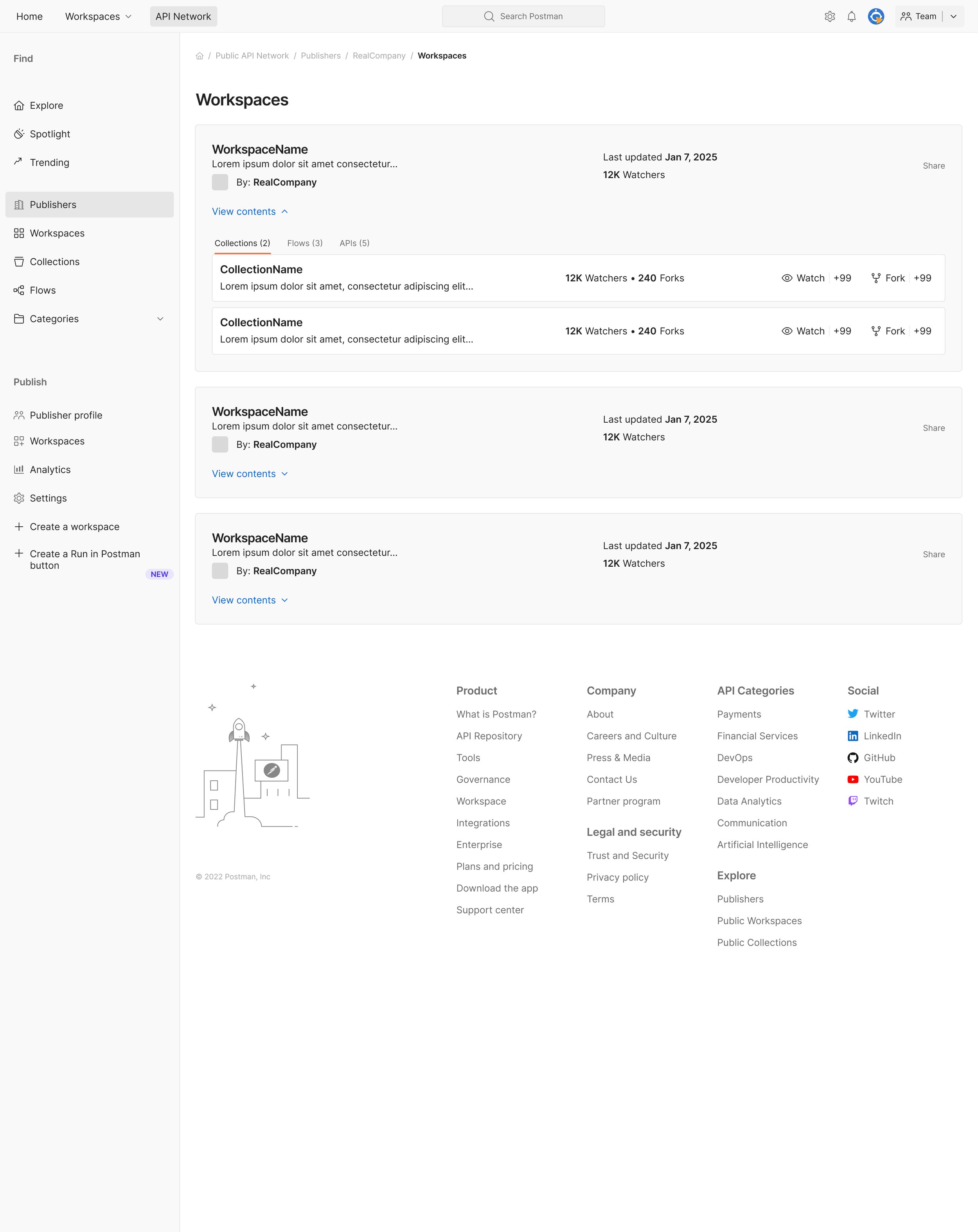
Publisher view, workspace category page: Profiles with more than two workspaces include a dedicated workspace page, accessible directly from the left-hand navigation. This page gives publishers a clear overview of all workspaces, their content, and quick actions available within each workspace category.

Publisher view, analytics page: Previously buried deep in the site, the analytics page was moved to the left-hand navigation for direct access. Few other changes were made at this stage, but the relocation alone significantly increased publisher engagement.

Consumer view, publisher directory: The publisher category page was previously buried in the footer, limiting consumer discovery and preventing SEO crawlers from indexing publishers and their offerings. My project surfaced the directory in the left-hand navigation, making it accessible from anywhere in the marketplace.

Consumer view, profile page: Any publisher’s profile is now reachable from the previously hidden publisher category page. Breadcrumbs clearly trace the user’s path and offer a straightforward way to navigate back through the site.
Consumer view, workspace category page: Any publisher’s workspaces are now reachable from the publisher profile. Breadcrumbs clearly trace the user’s path.
“Ulrika works with a strong team, but it was her leadership that led the team to focus on improving publisher navigation, and it showed up with a 71% increase in active publishers and a 110% increase in new publishers in April”
— Business leader for Postman marketplace
Outcome & Reflections
We launched the new navigation incrementally at 5%, 10%, 25%, and 50% rollout. Expectations were modest, as leadership assumed the updates would mainly prepare the ground for future features. Instead, the results were immediate and measurable: a 71% increase in active publishers and a 110% increase in new publishers.
The project showed how UX best practices can drive growth even before new features ship. It also marked a shift in team culture, establishing design leadership as a driver of measurable business outcomes. As my manager later put it:
“Ulrika continues to raise the bar on product design at Postman. Over Q1, the home for PAN publishers began to come to life. Ulrika works with a strong team, but it was her leadership that led the team to focus on improving publisher navigation, and it showed up with a 71% increase in active publishers and a 110% increase in new publishers in April.”
Next: new features for growth
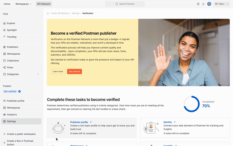
The successful publisher navigation project laid the groundwork for new growth features. First came publisher verification, aimed at boosting engagement and content quality. The improved navigation made the feature easy to find, and the updated pages made verification clear and easy to explain.